
Trusted by over 2,000 users
160,000+
Suppliers created
9000+
Tenders sent
55,000+
Contracts created
$650m+
Realized Savings
The first procurement system that configures to you, not the other way round. A platform that your team actually wants to use, built to remove the pain and give you control.


.png)
.png)


.png)

.avif)


.png)

.png)


.png)
.png)
"Other systems we've tried have felt so clunky and complicated that we haven't known where to start. Anyone looking to move away from the days of Excel should really consider trying this out."

"Very interactive, I can analyze supplier and manage all contracts within the platform. Really quick and easy to learn."
"Great price and really easy to use. Similar software's we tried only gave the basics and one other module for the same price however using oboloo I can manage my contracts, suppliers and create as many RFQ's as I like."
"Really user friendly, very powerful, feature rich, great to move away from excel spreadsheets."
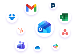
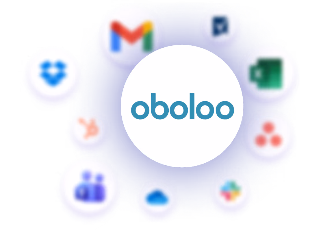
Seamlessly connect oboloo with 1,000’s of other tools — no code required.
.png)
Tailor the platform to fit your linguistic preferences and streamline communication across your organization and with your suppliers.
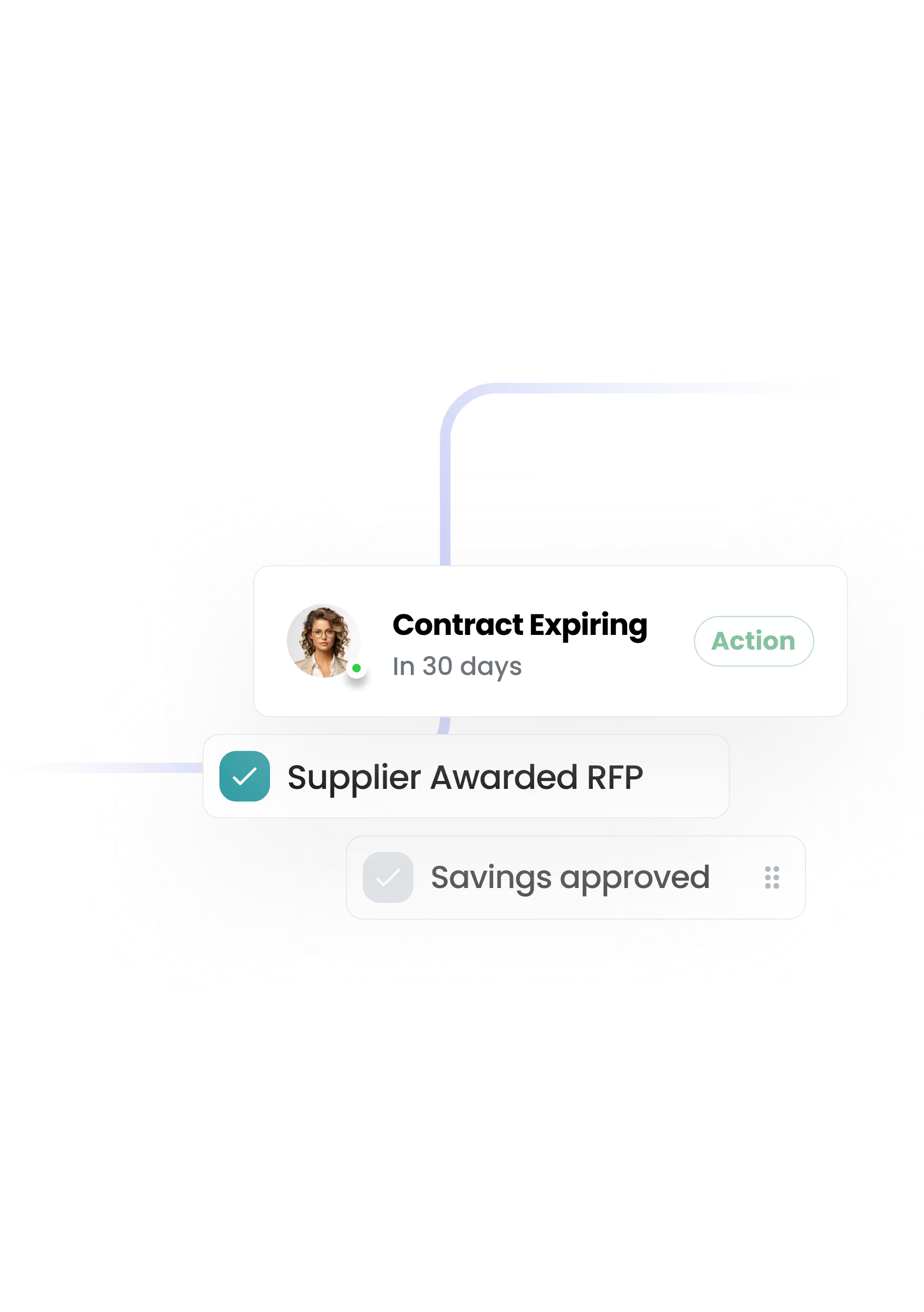
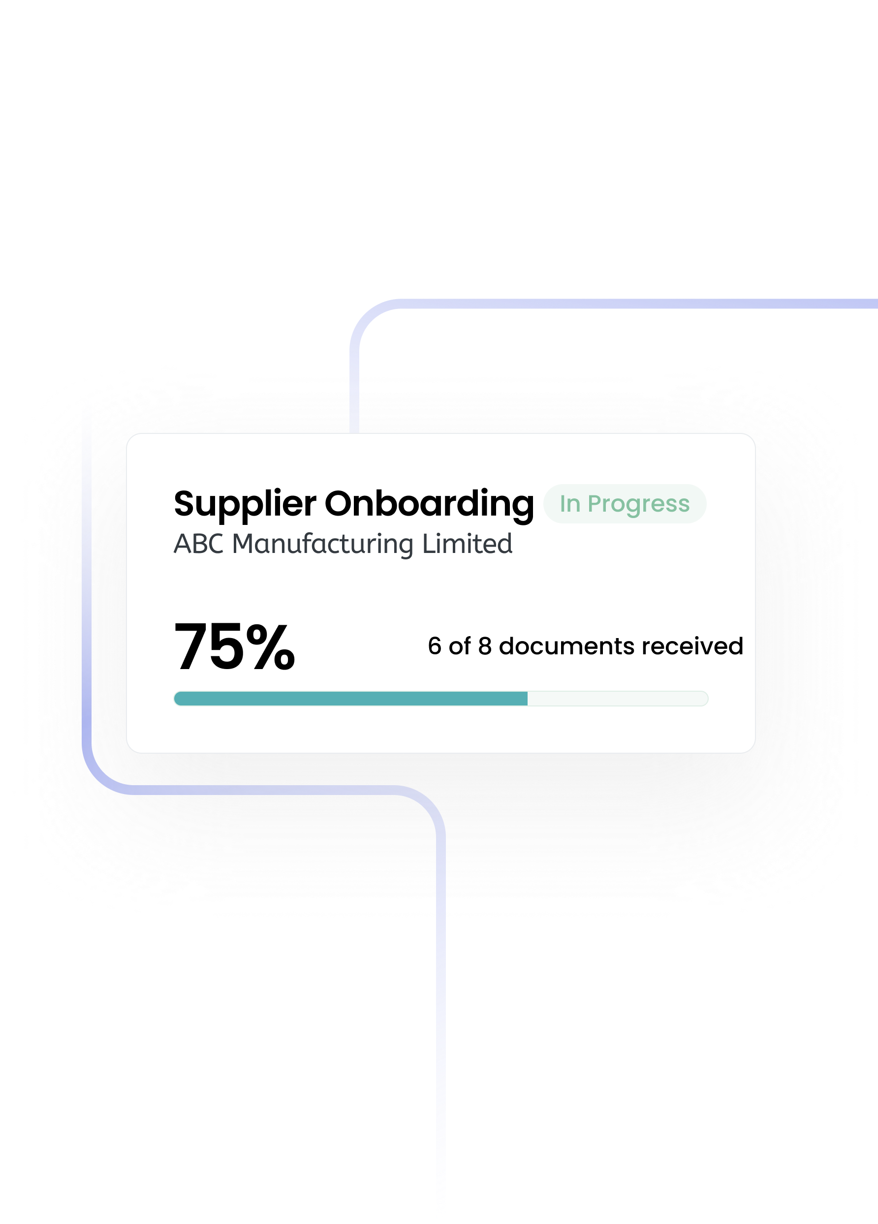
Manual processes, scattered files, endless emails.
The single source of truth for you and your team.
.png)
.png)
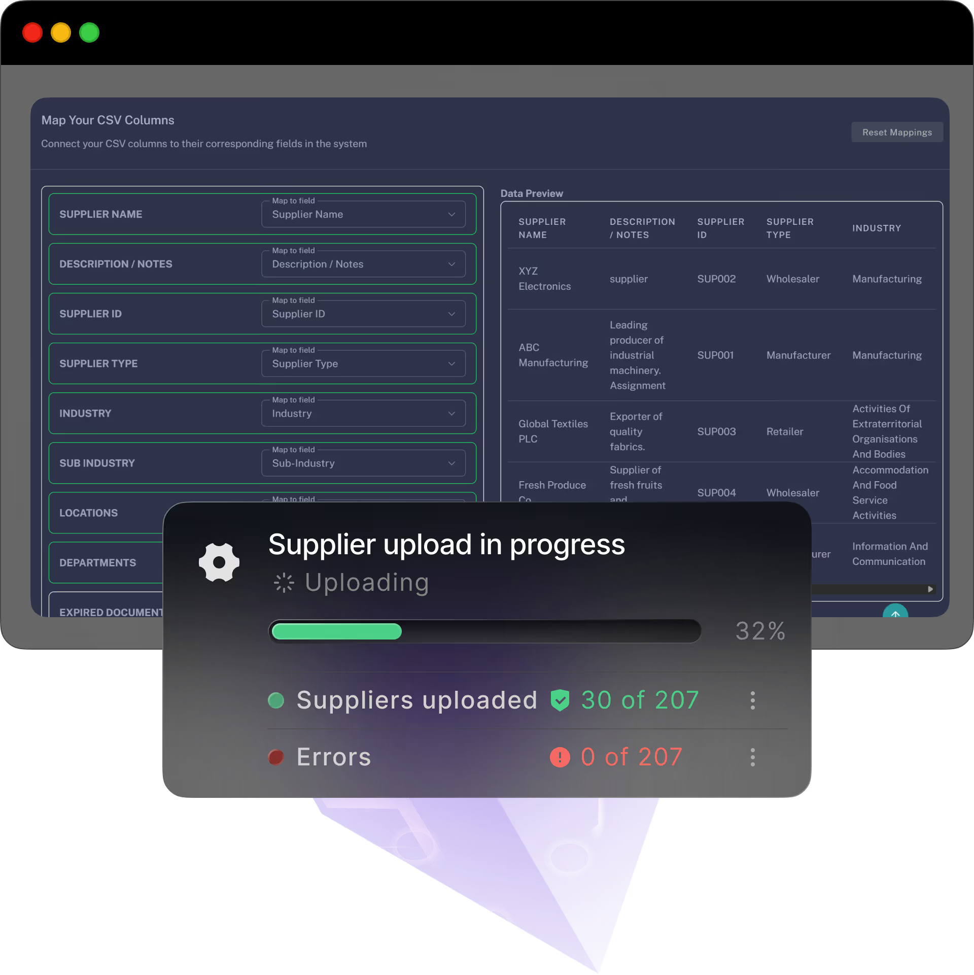
A simple, self-serve path with optional free and personlised onboarding and training — bring your data, follow the steps, and you’re live before the week’s out.
.png)
.png)
Slack is a platform for team communication: everything in one place, instantly searchable, available wherever you go.
OpenAI integration for GPT-3, DALL·E, or Whisper. Build AI powered workflows with OpenAI’s powerful models.

Integrate all the apps your organisation currently uses through one no-code platform, Zapier.
Salesforce is a leading enterprise customer relationship manager (CRM) application.
QuickBooks Online is the web version of the popular accounting packages QuickBooks.
.png)
Docusign is an electronic signature technology for facilitating electronic exchanges of signed documents.
.png)
Microsoft Teams is the hub for teamwork in Office 365 that integrates all the people, content, and tools your team needs

NetSuite is a cloud-based ERP that provides accounting services, financial management, CRM, inventory management and more
Xero is an accounting app that lets you track businesses expenses and accounting with intuitive mobile apps and web interfaces


.png)

.png)
.svg)


.png)